Tuesday, April 23, 2013

Basic Drawing Tutorial!

Hello Everyone,

THE DAY HAS FINALLY COME!!!!!

The Basic Drawing Tutorial made by yours truly is now ready for your enjoyment and learning experience!

Basic Drawing Tutorial

By: Tanaja S. Grier

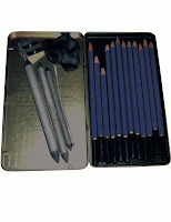
Step 1: Prepare your workspace. Lay out all of your materials and have a reference photo ready at your disposal. The materials you will be needing for this project is paper from any source, an easel if you prefer drawing with your work propped up, drawing pencils, sharpener, eraser, tortillions/stumps, and your reference picture.
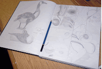


Step 2: Find a blank sheet of paper or a blank page in your sketch book to draw on.


Step 3: Pick a point on the blank piece of paper and choose a part of your reference picture you want to start drawing the outline. Begin drawing the first part of your outline with your drawing pencils. Such as one of the lower petals.


Step 4: One at a time, draw parts of your reference picture. Draw the petal on the other side of the flower.


Step 5: Draw the front petal in the middle.


Step 6: Draw the remaining petals to complete the outline of the flower head.


Step 7: Draw the stem and the leaves.


Step 8: After you have completed the outline of your drawing. Go back into your drawing and sketch out the shadows on one petal that is shown in your reference picture.


Step 9: Sketch out the remaining shadows in your drawing until the entire outline is completely filled. 

Step 10: Using your stumps, rub the sketch marks that represent your shadows until they are smooth. This technique helps to make your drawing look more real and show texture like in the reference picture. When you are finished, make the necessary corrections you feel you need to do and if you want to keep your drawing, sign your name and date at the bottom of the paper.


Congratulations! You have drawn a tulip!

For a more visual demonstration, refer to the either the diagram or the video clip below.


Thank you for watching and for participating! :-)


Monday, April 15, 2013

Diagram

Hello Everyone,
This is the diagram that will be included in my tutorial.

Monday, April 8, 2013

Edited Pictures

Hello Everyone,
These are the pictures edited in Photoshop. Observe as these pictures are more brighter, sharper, and more cleaner than the original untouched photos from the previous blog.


Wednesday, April 3, 2013

Original Photos

Hello Everyone,
These are the original pictures that will be edited for the final tutorial blog.


Monday, April 1, 2013

First Tutorial Video

Hello,
I have finally finished my tutorial video. I have great confidence in this video and hope that it matches up to the standards of an amature video posting that you would likely see on the Internet. I did this video one night at 4 am in the morning, so I apologize if my voice sounds a little dry and monotone because of my tiredness. The video is almost 10 minutes long, but it is not in the least boring and I believe that it catches the viewer's attention on the basics of drawing. So please enjoy and tell me what you think of my very first tutorial video on Basic Drawing!


Thank you for watching.

Sunday, March 17, 2013

Step-by-Step Tutorial

Hello Everyone,

I will be discussing the step by step process of the tutorial idea I have chosen from the last blog entry. I chose my first tutorial idea that consists of drawing a random object or figure with drawing pencils. That means that the final product will be a black and white drawing. Instead of having two seperate videos, the outline and the shading parts will be in one video. The object/figure will not a large or complicated and will most likely be a simple flower. Before I record my tuturial, I will already have my work area set up and my materials out and ready so I will not be fumbling to gather my things. This is the step by step of my tutorial:

Step 1:
Introduce myself. (0:05 mins.)

Step 2
State the topic of my tutorial. (0:05 mins.)

Step 3:
Make a few suggestions for a good work area. (0:10 mins.)

Step 4:
List the materials that will be needed for the drawing. (0:15 mins.)

Step 5:
Discuss the importance of a reference picture. (0:10 mins.)

Step 6
State the object that we will be drawing. (0:05 mins.)

Step 7:
Draw the outline. (3:30 mins.)

Step 8:
Shade the object in. (2:00 mins.)

Step 9:
Give tips on making your drawings better. (0:20 mins.)

Step 10:
End the tutorial. (0:05 mins.)

Monday, March 11, 2013

Prints and Binders

Hello Everyone,

Today in class, Mrs. Dersch brushed up on some important facts about printing projects created in the Adobe Creative Suites and identifying different kinds of binding for booklets, graphic books, etc.

Some Notes:

REMEMBER: Your print will always be darker than it looks on the screen so . . .

  • Adjust colors and photos accordingly.
  • Print proofs to review how your piece looks printed
  • Remember your color mode -> CMYK in Print; RGB in Web
PHOTOSHOP PHOTOS!!!

Projects with bleeds (colors covering the whole entire page) should be printed on larger paper than the document on screen.

A Few Basic Bindings:

Saddle Stitch -> Staple book (book held together by staples going down the middle.)

Comb Bind -> A binding that has teeth that holds the pages together. (Pages can be rearranged, added, and taken out easily.)

Spiral Bind -> A book held together by metal wire in the shape of a spiral. (ex. a notebook)

*Buy a Bone Folder (burnisher)!

Monday, March 4, 2013

First Day in InDesign!

Hello Everyone,

Today, the class began working on our layouts in InDesign. I used the sketches I did before to help me layout the first pages of my booklet. First I had to decide how my booklet will be put together and how I will bind it. Mrs. Dersch said the most simplest way to bind a booklet is to do a stitch binding which involves stapling the pages together, so I was going to have my book in a stitch binding.

The first I did in InDesign was create my cover page. I wanted it to be simple and the text to flow easily  on it. I also wanted my booklet to be uniform so I decided to stick with one text style since Mrs. Dersch said to have a minimum of two type faces in a booklet. So I stuck with Minion Pro, a professional and readable typeface.

Next, I chose the color of booklet. I wanted the cover page to be an exact same color as the rest of the pages so I chose a simple cyan color. It not too bright for it to hurt the readers eyes and not dark to make the text unreadable. I also included an image of my drawing pencils to match the theme of my tutorial. However, I changed the opacity to a lower level to make it transparent to it won't steal all of the attention from the text.

After I was done with the layout of my cover page, I had my teacher review it. Mrs. Dersch said that it looked good, but the reflection of the flash from my camera was obscuring the picture so I made a mental note to fix that later.

Wednesday, February 27, 2013

Adobe Creative Suites - InDesign 2

Hello Everyone,

Today, We freshened up on some old notes about file types and some new ones and talked about our final project that will be due a the end of the semester. We learned how to save an image file the different types of file to save an image in. At the end of the class period, we learned how to save important files that involve a client's design request.

Some Notes:

Importing from Documents:
.doc, .rtf, .txt

Place an Image File:
.eps, .tif, .jpeg (Lossy File), .png
(For .jpegs, save a COPY!)

File System:
client_lastname of designer_cmyk.indd
companyname_logo/product_2c/vector/HR/LR.png

Project:

Screen Version                    Hard Version
written (typed) tutorial         written tutorial
photo examples                    photos (cmyk, lighter, etc.)
- take photos
- edit in photoshop
diagram (illustrator)             diagram (for communication)
video/sound clip                  InDesign Layout (PRINTED)
(embedded)

Some More shortcut keys:

Shift + Option + Command = Resize proportionally
Command + G = Group
Shift + Command + G = Ungroup
Command + F = Find/Change
Command + B = Text Frame Options

Monday, February 25, 2013

Sketch Presentations

Hello Everyone,

Today in class, we spent the class period answering questions about what needed to be cleared up about any of the Adobe programs that anyone needed to understand. After questions were done, we spent the rest of the class period showing our final Charrette sketches and detailing about what our Charrette will possibly look like.

I believe I was the first one to present, so I stood up in front of the classroom and presented my Charrette sketch to the class. I described what my concept and the symbols in my drawing and what they represent. I also had notes in various places beside my symbols in order to describe what they mean and how they were placed.

My composition consists of a sky perspective of a man asleep in his bed and his dream begins to come to life in his coverlet and his imaginary lover who is a succubus in disguise starts to reach out from his dreams and connects with his subconscious and meld with his mind. The male is sweating because the dream that he wants to succumb to is draining his energy. There are numbers hidden on the creases in his pillow symbolizing his time is counting down. The pillow itself is a symbol of his subconscious mind and its combining with his dream. My project will be called When You Are Asleep . . . because it is depicting what I think happens when a person is asleep and where the dream will project itself when that person dreams of it.

Wednesday, February 20, 2013

Group Day!

Hello Everyone,

Today was a group day to brainstorm up ideas for our Charrette which was quickly approaching. So we had to get in groups of two and talk about our final ideas for our Charrette. My partner was Omari Wilson. He is one of the most talented studio artists in our class, so I know he is going to have some good ideas about his Charrette and maybe some tips for mine.

Since the theme of the Charrette this semester was Homage, I decided to do an Homage piece based on my favorite art Salvador Dali. Omari wasn't sure what artist he would do his project on yet. At first he wanted to do the homage on the artist who made the Campbell's soup design. What he was sure about was that he didn't want to do his project on paper, but on a different material.

My homage on Salvador Dali was a little bit complex. My concept was since most of his work was based on is dreams, I wanted to do my project on dreams. So at first it would depict a person sleeping their dreams coming out of their subconscious mind into reality. However, I wanted to simplify that concept.

Near the end of the class period, we all stood up one by one, introduced our partners and talk about their ideas for their project. So for homework, we had to do our final sketches of our Charrette projects.

Monday, February 18, 2013

Adobe Creative Suite - InDesign 1

Hello Everyone,

Today in class, we covered some of the basics that makes up Adobe InDesign. InDesign is a program specifically made for layouts. NO OTHER PROGRAM IS DESIGNED TO MAKE LAYOUTS!!! Such layouts can be for magazines, booklets, brochures, menus, business cards, etc. When it comes to printing in Adobe programs, the required printing colors are CMYK and/or spot colors that are best for printing. RGB is associated with web images from the Internet.

Not only did we learned about the required settings, we learned about Master pages and what they are used for, spaces in letters, words, pages, and the definitions of a layout and how it is set up.

Some Definitions are:


  • A-Master - Template for all or specific pages in the layout.
  • Liguratures - Makes two letters into one object.
  • Soft Return - Shift + Enter
  • Hard Return - Enter
  • Rivers - Spaces that travel down the text.
  • Kerning - Spaces between words.
  • Leading - Spaces between letters.
  • Gutter - Space between pages.
  • Spread - Two pages side by side.

Wednesday, February 13, 2013

On the Big Screen!

Hello Everyone,

Today, Mrs. Dersch put our lesson for the day on the big screen television in the classroom. Connecting her laptop to the television, she showed us one of her works in progress from her job and demonstrated on how to use live trace, the various pen tools, how to manipulate lines and points, alignments.

Live Trace - Changes the stroke of the image (it is best to have your image in black and white)

Subtract Pen - Deletes points to make an image more cleaner. (Pen tool with a subtract symbol at its side)

Anchor Point Pen - Fixes pen points and vectors that cuts off the image. (Pen tool with an arrow head by its side) *Command + Z = Return previous points*

In order to make a stroke a shape = Object tab > Path > Outline Stroke


  • Vectors and points will only show on an image if the image is livetraced!


Align Tab - Adjusts the alignment and spacing between selected objects.


Command + F = Paste in Front

Command + B = Paste in Back

Need to Knows:

A photoshop file that is placed in Illustrator is pixelated!


Monday, February 11, 2013

Raster VS. Vector

Hello Everyone,

Today in class we learned the difference between raster and vector.

RASTER                             VS                                VECTOR

Photoshop                                                                  Illustrator

Pixels                                                                         points and lines

                                                                                  type (not for large quantities of type)


We also discussed some basic icons in Illustrator. Most of the icons have arrows at the corner of their boxes; indicating that there are more icons relative to the visible one in the bar. For example:


  • The pen tool
    • Pen tool w/ + (adds points)
    • Pen tool w/ - (deletes points)
  • Square tool
    • Ellipse tool
    • Bevel square tool
    • Star tool
    • Hexagon tool
    • Glare tool


Wednesday, February 6, 2013

Scanner and Camera - Importing Images

Hello Everyone,

In class today, we talked about taking pictures with a digital cameras and how to measure the proportions of images on to regular paper and importing images from one location to the next.

When transferring an image in best quality possible, raise the resolution to at least 300 ppi.

Go to File to import images from your chosen source.

Go to Image Size in Photoshop to change resolution.

The larger the image, the higher the resolution.

BACK THAT THANG UP!!!
EXTERNAL HARDRIVE
BURN TO CD/DVD
iCLOUD STORAGE

Monday, February 4, 2013

Adobe Creative Suite - Photoshop 2

Hello Everyone,

After learning the basics about Adobe Photoshop, the class went to the Internet or through our personal pictures and chose an image of our choosing to edit in Photoshop. Once we uploaded our photos. She showed us how to use effects such as blur, sharpen, change the image size, masking, healing tools, and paths. We also learned some new shortcut keys like:

Command + D = Deselect

Command + N = New Document

and some new definitions and tips that we would be needing to know.

Tolerance- increases the rang of the magic want selection.
You can use Gaussian blur to cover up pixelated areas.
The Mask allows you to select greater detail.

Wednesday, January 30, 2013

Adobe Creative Suite - Photoshop 1

Hello Everyone,

In class today we learned about the basics of Adobe Photoshop and what it is used for. Photoshop is ONLY used for editing pictures. It is set in pixels and is rasterized. You can edit photos,  create photo illustrations, and effects. However, out of all the Adobe programs, Photoshop is used the least.

Website and camera pictures are rasterized/pixelated. It measures its images in ppi or pixels per inch. and it is best to work in RGB with a screen image.

The colors in Photoshop are set the RGB - Red, Green, and Blue.

We aslo learned about other colors and what they are used for like:

CYMK - For print (Cyan, Yellow, Magenta, K=Black)

Grayscale- Printing newspapers

Hex Colors (six colors) - Web colors

Monday, January 28, 2013

Charrette Brainstorm

Hello Everyone,

Since it was time for the art students to begin working on the Spring 2013 Charette, Mrs. Dersch wanted up to brainstorm up any words that relates to this semester's theme: Homage. First we looked up the definition of homage. Homage is when you are paying your respects or tributing acknowledgement to an important person. So one by one, the class listed off words such as:

  • honor
  • paying honor
  • symbols
  • sacrifice
  • elders
  • monogamy
  • progeny
  • memento
  • immortality
  • elevation
  • revolution
  • memorial
  • devotion
  • tributes
  • music
  • progress
  • history
  • senior citizens
  • ancient civilizations
  • dedication
  • inspirations
  • peace
  • suffering
  • royalty
  • worship
  • future
  • love
  • spiritual faith
  • effigy
  • cognition
  • pedestal
  • renaissance
  • devine, etc
At the end of class, each person chose four words out of the cluster of brainstorms. My choices were honor, future, progress, and music.

Wednesday, January 23, 2013

Before the Computer

Hello Everyone,

Today in class everyone participated in listing out the things we do to gather information on a project before we put the ideas on computer. We spent the whole class listing things such as:


  • brainstorming
  • research
  • write a list
  • meditation
  • take a walk
  • listen to music
  • read books
  • go to a museum
  • mind map
  • collaboration
  • sleep
  • eat
  • talk and listen
  • looking at other works, etc

Monday, January 21, 2013

Tutorial Ideas

Greetings Everyone,

      I am assigned to create two ideas for a tutorial: an initial one and a backup. If I was to create a tutorial, I would make sure that it wouldn't be too long; maybe no longer than five minutes, I would make sure that I supply my viewers with all the information they need if they run into any problems. My subject may have one or two videos to go with it, but they all will be at a minimum length and straight to the point.
    
     Since, I prefer looking at videos, my first idea will be doing tutorials on drawing with drawing pencils; I will use no color. With the help of a second party, I will be recorded drawing various things like body parts, human bodies, animals, plants, etc.

     My video will take place in a spacious area or a studio. I will start my video off by introducing myself and stating what I will be drawing for the video. I will state basic shapes that will be included in the drawing and draw on a large drawing paper. I will state what you should do and not do when drawing and some tips on how to do better drawings.

My backup plan for a tutorial is to teach others how to color with colored pencils in a more professional way, or as artists would like to call them prismacolors. It is not the same as coloring an object with one color and being done with it. It takes a process called layering and will make the object look more real and three-dimentional. If I end up using my second idea, it will only consist of one video instead of two. I will already have an outline of an object ready when the video starts and a row of prisma colors that will be in use. The objects will not be big, but big enough that the viewers would see it clearly. Step by step, I will color the object, stating the name of the color I am using and how they contribute to the drawing.

     I chose my tutorials to be on drawings and coloring because ever since I was young, my peers have always been fascinated on my drawing skills and wanted me to teach them how to draw like myself. I was never the teaching type of person, but I have no problems showing how I worked my magic. My video tutorials will be the most helpful because you will be able to see the process of the picture that is being drawn. My backup idea is good as well, it will take up less time, which is good. However, I believe that some viewers wouldn't be that interested in it. What do you think about my ideas? I'm all for suggestions! Thanks for reading.
Until next time! :-)

Wednesday, January 16, 2013

Entry 1- Brief Bio

Greetings,

My name is Tanaja Grier and I am new to Blogger. I am from Chester, South Carolina and I am currently attending Virginia State University as a freshman. I am majoring in graphic design and minoring in photography. I love to spend time with my family and friends, r&b music, art, and having fun.

I named my blog Campus Life because I would like to share my experiences of college life with others. Whether, it is asking for help with a problem or just sharing interesting stories, it doesn't matter as long as the writers read, understand, and have fun with this blog.

I created this blog for my Computers for Artist class. Our topic at the moment is about tutorials. Our assignment was to research different tutorials on different subjects and display which websites had the best or worse tutorials and why. I have researched and discovered three tutorials that I would like to share my thoughts on:

www.foodnetwork.com
Food Network.com has an abundance of video tutorials on cooking. I like their tutorials the best because the videos are crystal clear, you can understand the speaker, and when they cook, the videos are not too long or too short, they do it step by step and discussing healthy tips on delicious food as well as healthy recipes.

www.gardening-guide.wonderhowto.com
This website is about how to various things from little medicore tasks to complicated problems.The videos were very short and straight to the point which is good, but it leaving the viewer to wanting to understand more. The videos lack a lot of information and have, somewhat, a decent clarity.

www.iclassified.com
IClassified is a website to help people learn how to use Apple products. I disliked this website the most out of the three because there were no videos and all there was to view is numbered steps on how to use the products and a few steps were accompanied by pictures.

Monday, January 14, 2013

First Day of Computers for Artist Class!

Hello Everyone,

Today was the first day of my Computers for Artists class. I was kind of excited about it because this class is going to teach me the basics of what I will be using as a graphic designer. The class was scheduled at 5:30pm, but our instructor, Mrs. Dersch arrived at 5:50pm and announced that class will be starting at 5:50pm on Mondays and Wednesdays. I was glad for the slight change. I will have a little time to rest before her class after I get off work.

During class, she made sure we familiarized ourselves with the shortcut keys that would be very useful to making our jobs easier in the Adobe programs. Some examples of of shortcut are:

Control + Click = New Window

Command + C = Copy

Command + V = Paste

Command + X = Cut (takes out and puts it in paste)

Command + Z = Undo

She told us which programs are used for specific jobs. For example: Microsoft Word is for word processing such as essays, resumes, and typed documents. Microsoft Powerpoint is for presentations ONLY and both are not used for design.

Lastly, she listed off the types of files that we would need to familiarize ourselves with when saving our work and it is a way to identify which file is which. Some example of these files are:

.docx = only use Microsoft Word to open

.txt = text document; strips formatting; open with other applications such as Adobe Reader

.rtf = rich text format; formatting opened in any program